This is a Sample and Test Page – or I might just publish it anyway….
A Simplified Theme – A Great Need (for me) – This is Heading 1
This is a Paragraph. Simple is good. Simple is good. Simple is good. Simple is good. Simple is good. Simple is good.
Simplified Theme – Heading 2
This is a test page. Don’t take it seriously.
Simple (Bold) is good. Simple (Italics) is good. Simple (underline press Ctrl+U) is good. Simple is good. Simple is good. Simple is good. Simple is good. Simple is good. Simple is good. Simple is good. Simple is good. Simple is good. Simple is good. Simple is good. Simple is good. Simple is good.
This is a Quote. Simple is good. (Quote).
Simple is good.
Simple is good. (Preformatted, when you are typing "code")
Then back to Paragraph. Simple is good. 🙂
Test the Bullets
- Bang!
- Bang!
- Bang!
- Kaboom!
Test the Numbered List
- One
- Two
- Three
———–
Heading 1 – Start Fresh
The spectacle before us was indeed sublime.
Apparently we had reached a great height in the atmosphere, for the sky was a dead black, and the stars had ceased to twinkle. By the same illusion which lifts the horizon of the sea to the level of the spectator on a hillside, the sable cloud beneath was dished out, and the car seemed to float in the middle of an immense dark sphere, whose upper half was strewn with silver. Looking down into the dark gulf below, I could see a ruddy light streaming through a rift in the clouds.
BLAH BLAH BLAH Heading 2
Testing the scroll down and sticky menu on mobile devices. Start Fresh. Testing the scroll down and sticky menu on mobile devices. Start Fresh. Testing the scroll down and sticky menu on mobile devices. Start Fresh. Testing the scroll down and sticky menu on mobile devices. Start Fresh. Testing the scroll down and sticky menu on mobile devices.
And this is code “Preformatted ” H3
<<< (*&A(*U(D*Y*ASAS<<<< Code red blue yellow pink code for geeks >>>><<<<<
— > Work around to this is “Type this “– >” before the code?
<<>><<Code Pasted as Text. />>
And Bullets – Heading 4
- Bang bang!!!
- Bang bang again!
- Bang bang back!
- Kaboom!
— > Work around to this is — just do an * asterisk then press “shift enter”
* bullet 1 bang bang!!!
* bullet 2 bang bang again!
* bullet 3 bang
* Enter the work around
And this is a Numbered H5
- List
- List
- List
- List
— > Work around to this is — just do 1) and 2) the regular old typewriter way and then * asterisk then press “shift enter” (no sounds!)
1) Now Try This
2) Maybe this will work
3) Hmmm..
And a Block (shows as a bullet with asterisk …. and a box? Anyway … get to a workaround. No biggie. 🙂
- Bullet with asterisk
- another one
And a Quote
Quote quote quote by … lemme see… Okay cut and paste below …
Cool!
Now the quick workaround for the bullets and lists? I think I found in the quote:
Now let’s try
Bullet Regular typed
* Regular typed
* Regular typed
* Regular typed
Now let’s try
Numbered List typed
1) Regular typed
2) Regular typed
3) Regular typed
Testing the scroll up! (Back to top on right). Rrrright.
————
Segue:
If you are wondering why there seems to be no margin on the left, that is “on purpose”, so that the articles can be seen in all types of media devices. RWD (Responsive Web Design) entails having a theme that adjusts to a laptop screen, or a tablet or a phone. You can always “increase or decrease” Indent when you do a Toolbar Toggle (Shift+Alt+Z) while you are writing, in the “kitchen sink” in your WP Admin area. (What’s cooking?)
Some indentations or margins that look good on a laptop for instance, will get pushed to the middle of the screen, when your website is viewed on a phone screen, leaving a lot of white space on the left. Also in some smaller screens, the rest of your website will not show, (your contents on the right side of the screen), as in some operating systems, on older smartphones, there’s no scrolling from left to right, only scrolling from top to bottom).
If you minimize your window, you’ll see what it looks like. At the very bottom, I will attach how this Simplified Theme looks like in different screens.
This Simplified Theme, can have one-column or two or three.
This Simplified Page you are viewing now has one column,
The Products and Services Page has two columns,
The Credits Page has three columns.
And some pages have four columns, like our No Refunds Policy page for our I.T. Consulting Services. 🙂
What these two or three columns on a page do on smaller screens is they “stack” down, so that the contents flow nicely. and look “simplified”. 🙂
February 9, 2018 – The Simplified Theme … The Making of.
Warning… this might be a rant.
Okay, now the Simplified Theme is getting a tad bit complicated.
Our brains can take only take in so much of such amount of information and can only retain only a percentage of that. (Scientifically they say we can get exposed to about a million bits and pieces of information, but can only retain about 9 pieces of information, how’s that for size?).
I know that because I, in my own life search for meaning, did postgraduate studies – I studied “information”, or the “science of it”. I am an “informatician”. It is those people who study the science of information and how it is processed in our brains. You might have seen or heard of the word “informatics” – it’s short cut for “information science”. I became an informatician – certified in biomedical informatics. So what?
My brain ended up hurting more. It’s like you study a field that expands your mind and your way of thinking and there comes an understanding of how people interact with computers, or technology, or YOU. And then you get perceived as the weirdo, who come off as “you know it all”. Well, we (or I) can not apologize perpetually for who we are or for who we have become because of what we studied or know. We can share it, people can take it or leave it.
Because in pursuit of higher education comes knowledge and experience. And with each new complicated experience that you want or are called on to troubleshoot or assist (because you can, your brain is equipped for it ), comes wisdom.
But with that wisdom you have a responsibility.
The responsibility to expose, share, and STICK to the truth as you know it.
There is THAT moral obligation. So one can sleep well at night.
End of rant.
Now to the making of ….
I’m making notes now because I do not want to forget these many details as I move further along …. remember the 9 or so items that our brains can “retain” that I ranted about above?
Let’s see how much I have retained thus far… (oh yeah, I have been working on these for 16 hour days over the past 7 days now… fatigue is also a science somewhere… hehehe)
- Creation of the Core Simplified Theme stored in a nifty bare zip file.
- Tweaked files:
- Footer
- Header — I spent the most time in this file thus far. It will lay the “look” of the Core Theme.
- Created a folder for
- page-templates – what this folder does is it adds to the “Page Attributes” of your WP Pages, with the added files below, so that you have a choice on a page whether you want it to have “full width“, useful for “landing pages, or sales pages, without the header or footer. Or a “front page” layout.
- Added files:
- page-fullwidth
- page-frontpage
- In case …
Limitations of this Simplified Theme:
- It’s not on the WP Themes market. I created this for me, and for the more than 30+ websites that I am an administrator of, in some capacity or another.
- I am testing this theme WITH just a few WP plug-ins, as I know that plug-ins can really wreak havoc and wreck a website if there are incompatibilities, and also when they do automatic updates. Getting locked out of a website that you are a webmaster of is not funny. When someone hacks into your website, they can actually delete important stuff that does that. The only updates that I trust now is the one that WP pushes. With any other plugins, as far as I have experienced, you really have got to back up your website first before you click that “update” button. It’s frustrating how a WP admin area can turn into one targeted advertisement area from some plug in or theme creators. I’ve had enough of that too. Because it IS a pain in the neck to hunt down that code that broke your site. (Believe me when you have experienced too many broken sites, you would be happy to just put in the hours of creating your own theme… I remember when I first dabbled on HTML, I didn’t use any website creator, but just used plain old “notepad” and was typing the codes myself ….
<html>
<title>YOUR TITLE HERE</title>
<header>YOUR STYLES HERE</header>
<body>YOUR WEBSITE CONTENT HERE</body>
<footer>YOUR FOOTER HERE</footer>
</html>
And I just typed that up. 🙂 That’s the anatomy of a webpage, in a nutshell. And you can create a page using the “Notepad” in your Windows PC. Save the file as “.html” or “.htm” or “.php” and the world wide web www internet can read it.
- So back to the number of ACTIVE plug-ins with this Simplified Theme, I will update this below as I go along. So far:
- IgniteUp
- Akismet Anti-Spam
- Title Remover
- WordPress Importer
- If you want to add a full image picture on any part of your website, you can. Without having to install an additional theme or plug in. I wrote and included the code on the “header” file. (like I wrote above, I did a lot of trial and error and spent a loooong time tweaking that file! :-)).
- The code snippet is (put it above the <body> part.
<style>

p.fullwidth {
 margin: 0px;
}
</style>
7. And then on your page or blog post, just use the text editor, and put the code below in between your content or image.
<p class="fullwidth"> A paragraph with fullwidth specified.</p>
And this is a picture with a full width specified. Just Add Media, then open the Text Editor, then tweak the following:
<img
class="alignnone YOUR-wp-image size-full"
src="HTTP:// THE DIRECT LINK TO YOUR IMAGE.jpg" alt=""
width="1000" height="249"
/>
So this pic below:

will become this pic below:
Just change the width to 100% (delete the height) and then add the snippet below:
<p class="fullwidth">
<img
class="alignnone size-full YOUR-wp-image"
src="HTTP:// THE DIRECT LINK TO YOUR IMAGE.jpg" alt=""
width=100% />
</p>
Notice the <p for paragraph, and the class and the img width = 100%, just change those three items and you’re good to go. Don’t forget to close the paragraph with </p> 🙂
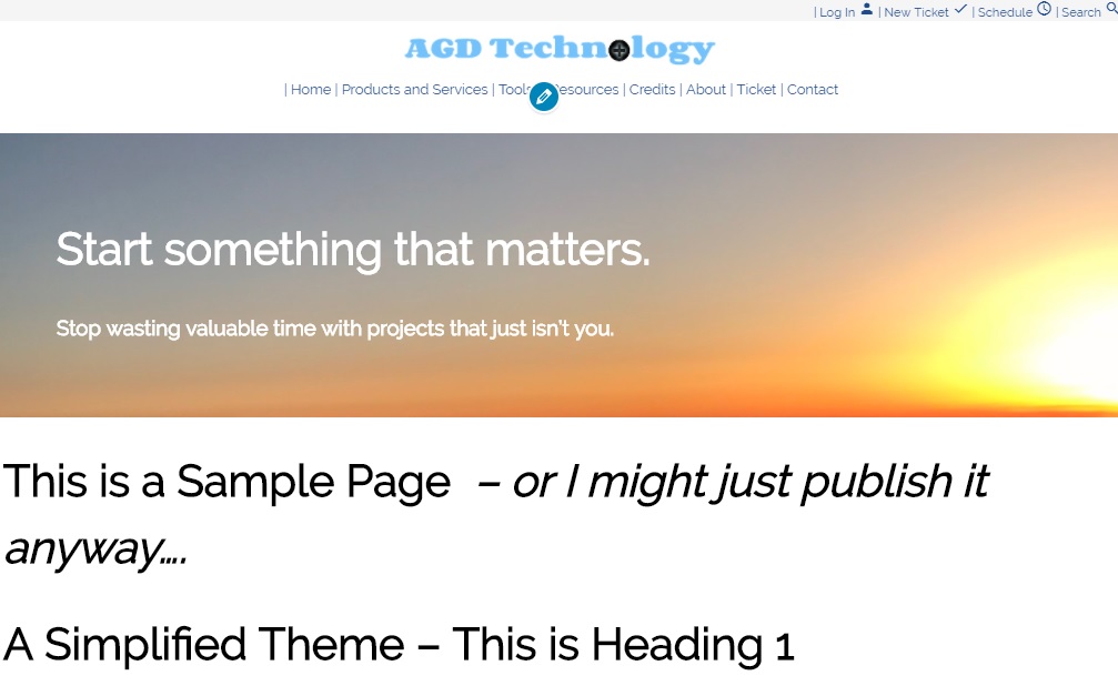
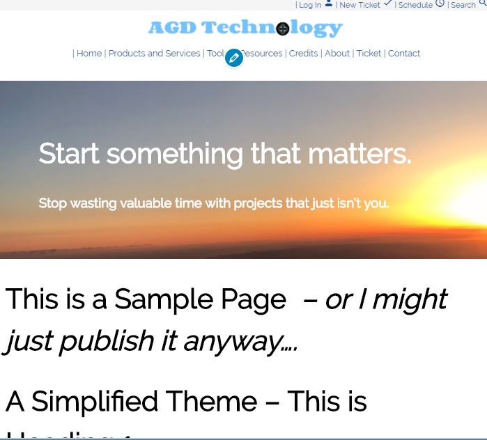
Screenshots of the Simplified Theme in Different Devices:
Laptop View:
Tablet View
Phone View

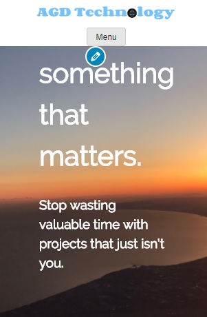
Notice how the Sentences and the Image adjusts to the screen. That’s Responsive Web Design!
And this is long because I am testing the MENU above to NOT disappear when you scroll way down. The Sticky Menu sticks. (Rather than typing Lorem ipsum blah blah 🙂 )
Notice the smiley on the footer. We work happy. Spread the smile. 🙂
This is a test page. Don’t take it seriously.